Analyzing device health
The Overall Health States card on the dashboard and the Device Analytics card on each devices page summarize the overall health of managed devices.
Status summary of all devices
From the XClarity Orchestrator menu bar, click Dashboard (![]() ) to display the dashboard cards with an overview and status of all managed devices and other resources (see Viewing a summary of your environment).
) to display the dashboard cards with an overview and status of all managed devices and other resources (see Viewing a summary of your environment).
You can change the scope of the summary to only those devices that are managed by a specific resource manager or in a specific resource group by using the Select manager drop-down menu.
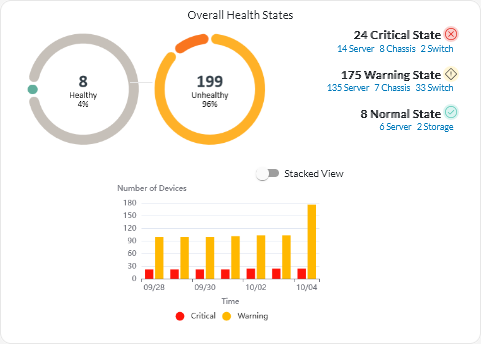
Each colored bar in the circular and bar graphs indicates the number of devices in a specific state. You can hover over each colored bar to get more information about the state. You can also click the number of devices in each state to view a list of all devices that fit the criteria.
Status summary of all devices of a specific type
To view the overall active alert summaries, click Resources (![]() ) from the XClarity Orchestrator menu bar, and then click the device type to display a card with a tabular view of all devices of that type. For example, if you select Severs, a list of all rack, tower, and dense servers and all Flex System and ThinkSystem servers in a chassis is displayed.
) from the XClarity Orchestrator menu bar, and then click the device type to display a card with a tabular view of all devices of that type. For example, if you select Severs, a list of all rack, tower, and dense servers and all Flex System and ThinkSystem servers in a chassis is displayed.
- Machine Type Model. (default) This report summarizes device health by machine type model (MTM).
- Machine Type. This report summarizes device health by machine type.
- Product Name. This report summarizes device health by product.
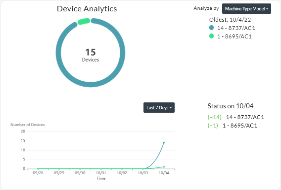
- A circular chart that shows the total number of devices that are unhealthy and percentage of devices in each unhealthy state (critical, warning, and unknown).TipEach colored bar in the circular graph indicates the number of devices in a specific state. You can hover over each colored bar to get more information about the state.
- A line graph that shows number of devices in each health state per day over the specified number of days.TipEach colored bar in the line graph indicates the number of devices in a specific state. You can hover over each colored bar to get more information about the state.
- The number of devices of each type that are unhealthy on a specific day. The current day is shown by default. You can change the day by hovering over each day in the line graph.