Analyzing performance and usage metrics
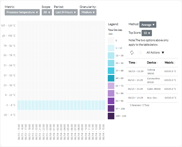
The Analytics panel contains report cards that shows heatmaps based on specific metrics and resources over a specific time period.
To display the performance heatmap, click Advanced Analytics (![]() ) > Predefined Analytics, and then click Performance Heatmap to display the related analytics cards.
) > Predefined Analytics, and then click Performance Heatmap to display the related analytics cards.
Performance Heatmap
This report card includes a heatmap that illustrates number of devices that have metric values within a specific number of ranges over a certain time period.
You can click any cell in the heatmap to display a popup list of devices that are represented by that cell, with information the actual metric value for each device and timestamp when the metric was collected.
You can configure the heatmap to show only the information that you are interested in.
- You can choose to display data for one of the following metrics.
- Processor temperature
- Processor utilization
- Memory utilization
- You can choose to aggregate the metrics data based on the average or the peak (highest) value.
- You can filter the heatmap to include only metrics data for devices in a specific device group.NoteIf you scope the user interface to a specific resource manager, only data for devices in the selected groups that are also managed by the resource manager is included in the heatmap.
- You can display data over the last 24 hours, last 14 days, or the last 30 days.
- You can also choose the number value ranges to display on the x-axis of the heatmap. The number of values between the maximum and minimum are divided into equal parts based on the number you choose. You can choose 10, 15 or 20.
- You can also choose to list the top 10, 15, or 20 devices with the highest values and the timestamp when the metric was collected.
Give feedback