You can add custom tabular and graphical reports to Lenovo XClarity Orchestrator by defining queries based on collected data, such as alerts, events, inventory, device metrics, or your custom metrics (aggregations).
Before you begin
Creating custom analytics reports in XClarity Orchestrator requires a basic understanding databases and database queries.
About this task
To create a custom report, complete the following steps.
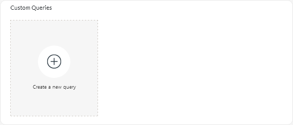
- From the XClarity Orchestrator menu bar, click , to display the Custom Queries card.
- Click the Create icon (
 ) to display the Create Custom Query dialog.
 - Specify a unique name for the custom query.
- Select the type of data that you want to use as the source for this query.
You can choose one of the following data-source types.
- Alerts. Hardware or management conditions that require investigation and user action
- Events. Resource and audit events
- Events-Resource. Hardware or orchestrator condition that occurred on a managed device, resource manager, or XClarity Orchestrator
- Events-Audit. User activities that were performed from a resource manager or XClarity Orchestrator
- Inventories-Manager. Inventory data for resource managers
- Inventories-Device. Inventory data for managed devices of all types
- Inventories-Device-Server. Inventory data for managed servers
- Inventories-Device-Switch. Inventory data for managed switches
- Inventories-Device-Storage. Inventory data for managed storage devices
- Inventories-Device-Chassis. Inventory data for managed chassis
- CPUTemp. Metrics data for the temperature, in Celsius, of each processor in a managed device. The metric is captured every minute.
- CPUUtilizationStats. Metrics data for the processor usage, as a percentage, for a managed device. The metric is captured every minute.
- InletAirTemp. Metrics data for the inlet-air temperature, in Celsius, of a managed device. The temperature is captured every minute.
- MemoryUtilizationStats. Metrics data for the memory used, as a percentage, by a managed device. The metric is captured every minute.
- PowerMetrics. Metrics data for power consumption, in Watts, by all processors, memory modules or the entire system for a managed device. These metrics are captured every 30 seconds.
- PowerSupplyStats. Metrics data for power supply input and output, in Watts, for a managed device. These metrics are captured every 30 seconds.
The types of data sources (alerts, events, inventories, and metrics) that are listed vary based on the data is available in XClarity Orchestrator. For example, if alerts data is available, the Alerts type is listed. If events data is available, all Events-* types are listed.
The selected data source affects the data that is available on the Query Conditions tab. If you select a generic type, such as Inventories-Devices, only attributes that are common to all devices are listed. If you select Inventories-Device-Server, attributes that are common to all servers are listed.
- Click Query Conditions to define the query conditions for the report.
- Narrow down the data that you want to use for this query.
- Selecting one or more fields from the Filtered Fields drop-down list. The fields that are listed as based on the data-source type that you selected in step 4.
- If you selected multiple filter fields, choose the operator to use to construct the query. This can be one of the following values.
- AND. All values must match.
- OR. One or more value must match.
- AND (Negated). All values must be not match.
- OR (Negated). One or more values must not match.
- For each filtered field that you selected, select the comparison operator from the Comparison drop-down list and the value of field.
The comparison operators that are available differ based on the data type for the attribute.
- >=. Matches values that are greater than or equal to a specified value
- <=. Matches values that are less than or equal to a specified value
- >. Matches values that are greater than a specified value
- <. Matches values that are less than a specified value
- =. Matches values that are equal to a specified value
- !=. Matches all values that are not equal to a specified value
- Contains. (Inventory and event queries only) Matches any partial values specified in an array
- In. (Inventory and event queries only) Matches any values specified in an array
- NotIn. (Inventory and event queries only) Matches none of the values specified in an array
To find the current values for any field, create a new query with the same data-source type, select the field name from the Grouped Fields drop-down list, specify 0 for the Limit, and click Save. The Chart Options tab is display with a list of all current values.
- Optionally choose an aggregation function in the Results Aggregation section to create a new field based on the filtered data, and specify a name (alias) for the new field.
For some aggregation functions like average and maximum, you must also specify the field on which you want to apply the function.
For event and inventory queries, you can choose one of the following functions.
- Average. Statistical mean of all values
- Sum. Sum of all values
- Count. Number of values
- Maximum. Highest value
- Minimum. Lowest value
- First. Value with the oldest timestamp
- Last. Value with the newest timestamp
For metrics queries, you can choose one of the following functions.
- Count. Number of non-null values
- Distinct. List of unique values
- Integral. Average field value
- Mean. Arithmetic mean (average) of values
- Median. Middle value
- Mode. Most frequent value
- Spread. Difference between the minimum and maximum values
- Stddev. Standard deviation
- Sum. Sum of all values
- Optionally choose the fields that you want to use to group the query results from the Grouped Fields drop-down list.
When you choose a grouped field, XClarity Orchestrator unwinds (deconstructs) the data so that there is a data point for each value of selected fields.
- Optionally choose how to sort the query results by selecting a field from the Sort by Field drop-down list and the sort order from the Sort Order drop-down list.
For metrics queries, you can sort only by time.
- Optionally specify the number of data points to return in the query results in the Limit field.
The default limit is 10. If you specify 0 or leave it empty, all data points are returned.
You can also optionally specify the number of data points that you want to skip in the query results in the Offset field.
- (Metrics queries only) If you choose grouped fields, optionally specify the number of data sets to return in the query results in the Series Limit field.
The default limit is empty (0). If you specify 0 or leave it empty, all data sets are returned.
You can also optionally specify the number of data sets that you want to skip in the query results in the Series Offset field.
- Click Save to save the query and generate the report.
- Click Chart Options to choose the look and feel for the report. The following charts types are available.
- Click Create to add a new card that contains a report with current query results.
After you finish
You can perform the following actions from the
Customized Queries card.
- Enlarge a custom report by clicking the Enlarge icon (
 ) on the custom report card.
For tabular reports, the report icon on the Customized Queries card shows only the first four columns of the table. You can enlarge the report to see all columns in the table.
The See Details link in a table column indicates that column contains multiple data fields. Click on the See Details link to display a popup table that lists the additional data.
- Modify the properties a custom report by clicking the Edit icon (
 ) on the card.
 - Delete a custom report by clicking the Delete icon (
 ) on the card.
 ) > Customized Queries, to display the Custom Queries card.